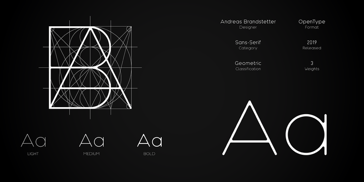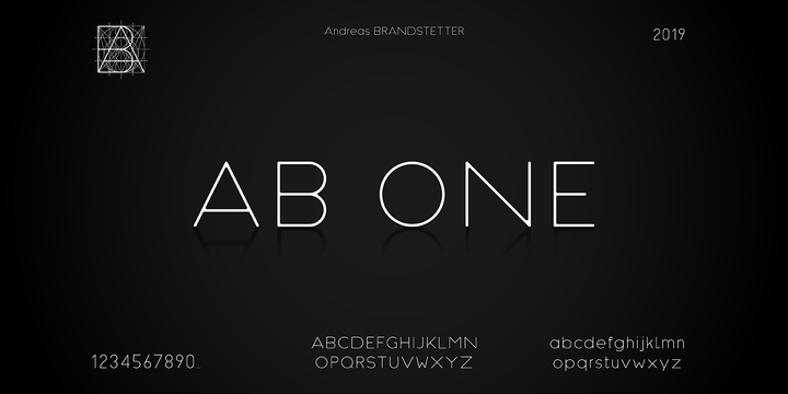
AB One is a sans serif font especially created for people with an eye for the details.
Its very cinematic and simple look is generated by having no edges in the single letters. The font was designed using a grid, that made it possible to create geometric but very dynamic shapes, influenced by architectural design.
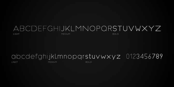
The initial idea was to create a font that would look nicely on titles for portfolios or prints, but by adding more different weights to the family, the versatility increased.
Download Now Server 1 Download Now Server 3 Download Now Server 2 Hawkes is an extensive handmade typeface family that comes with a bundle of weights, widths and styles, all designed to work cohesively. Here is a breakdown of the Hawkes family. Hawkes Sans: The primary subfamily is a sans-serif typeface that includes nine fonts: three weights (light, medium and bold) and three widths (narrow, regular and wide). Within this set are an array of stylistic features; including small capitals, character style alternatives, discretionary ligatures and contextual alternatives. See details below for more information on OpenType Features. Hawkes Variable Width Sans: The secondary subfamily is the same base sans-serif fonts but combined in variating widths. Essentially, it takes all three widths of each weight and randomly mixes them together. This creates a funky and...