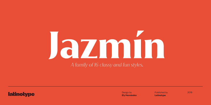
Jazmín is inspired by "Globe Gothic" design yet features different proportions, curves, serif shapes and contrast, which give it a classy, playful and a more contemporary look. The family comes in two versions: an elegant font of 8 weights-ranging from Thin to Black-with matching italics, and an alternate, more playful counterpart with the same number of weights and italics. The whole Jazmín set contains 566 characters which support over 200 Latin-based languages. Jazmín is ideal for magazines, short text, logos, branding design, packaging and advertising.
Minigap Minigap is a geometric sans serif family that has a minimal height difference between upper and lower case. In other words if you’re into typography, it has a very high x-height... yes, very high. The choice was made to finally have a typeface that could appear very neat, reducing ascending and descending parts of the glyphs (b, d, g, j, l, ...) that could interfere with the lines above and below. All of that without going to extremes in a unicase style but also without renouncing to a great legibility. This aesthetic, in fact, translates into a pleasant visual effect that creates well-defined lines and enhances the layout, looking excellent on small screens. A meticulous optical correction, starting from pure geometric lines, was applied to every glyph, aiming to obtain the best version of each. The pointed corners of capital letters and numbers have been kept even in the heavier styles, to give consistency to the family. You can clearly see how clean they look. Stylist